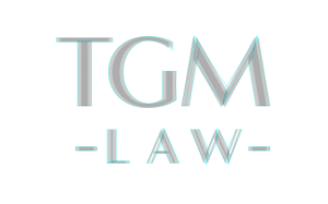
This is your brand guide
Be conservative!
Logos inspire confidence, not excitement
Following are typical use cases of light, grey, and dark iterations of your logo placed against light, mid-tone, and dark backgrounds.
Typical use cases
First four combinations represent most common recommended pairings of logo and backgrounds. Moderate contrast shows greater confidence and visual balance.
The outlined version of your logo has a slight 3d effect which is most effective on lighter backgrounds.
DARK logo on dark background and LIGHT logo on light background included to make clear the not-quite-white and not-actually-black colours of the logo.
Colour definitions:
dark logo is #002b33 at 100% and 50% opacity
grey logo is #5b6466 at 100% opacity
light logo is #fcfbfa at 100% and 50% opacity
A full colour logo can be defined at your discretion.
LIGHT
on mid-tone
GREY
on light
GREY
on dark
GREY
on mid-tone
LIGHT
on dark
OUTLINED
on mid-tone
OUTLINED
on light
OUTLINED
on dark
DARK
on light
DARK
on dark
The DARK on dark placement and LIGHT on light placement would almost never be used.
They are provided to illustrate the cream of the white logo and the deep ochre teal of the dark logo.
LIGHT
on light
A brief development timeline
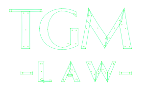
Based on initial consultation, a wordmarque based on strong sans-serif font is recommended.
Logo to express strength, integrity, and balance.
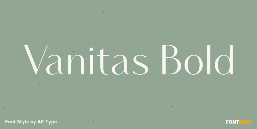
Derived from Vanitas font, an elegant typeface of a group often seen in prestige placements such as fragrances and fashion. Much bolder strokes (150% wider than original) provide greater overall strength and presence.
The treatment of the top of the “G” is slightly aggressive, and the remaining glyphs are constructed of asymmetrical concave curves rather than typical straight lines. This provides rhythm, and prevents strength from descending into rigidity.
The result is the comfortable familiarity of a modern classic that nonetheless remains fresh and 100% unique.
-
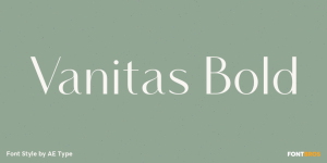
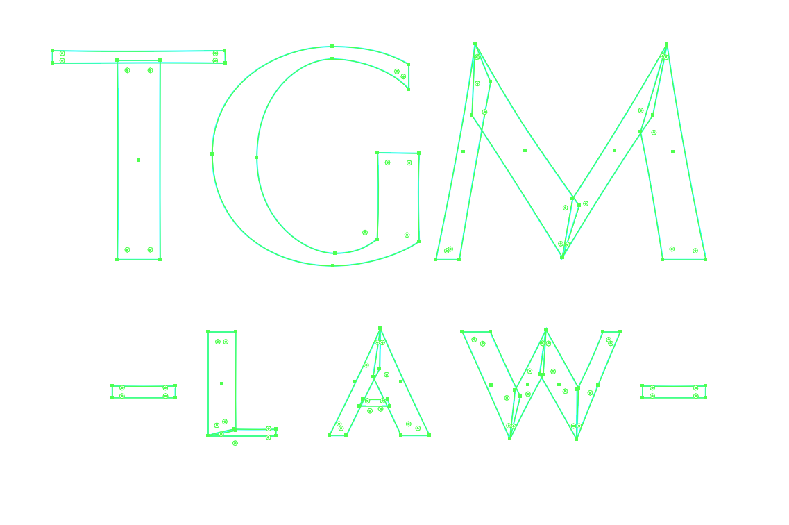
- Vanitas – original typeface
-

- Vanitas Bold, doubled to increase stroke weights 50% beyond original.
-
- Custom glyphs are hand drawn using doubled Vanitas as a rough guide.
-
- Digital construction.
-

- Clean up.
-
- Reduced contrast.
Inspiration typefaces
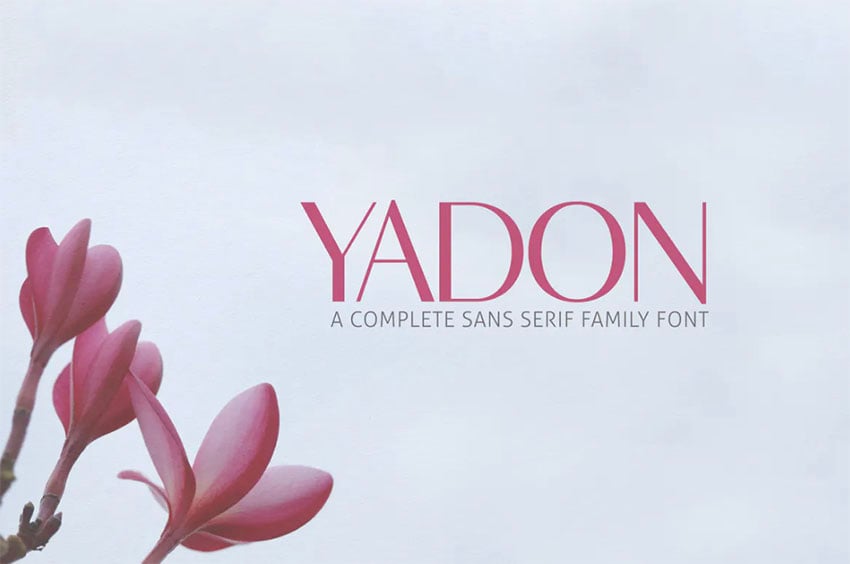
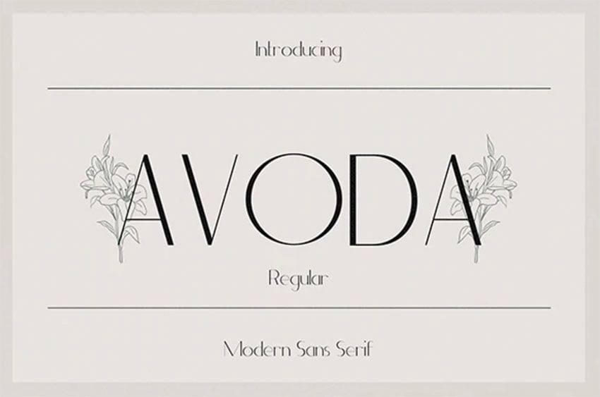
These are all sans-serif fonts with stroke variance, which presents as sophisticated elegance.
Typefaces in this category are typically light, so we adapted our chosen base font into a bolder variant to exude a strength more appropriate to the legal industry.
-
- Vanitas – original typeface
-
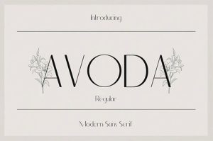
- Avoda – inspiration typeface
-
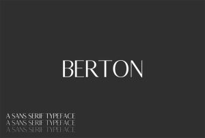
- Bertaon – inspiration typeface
-
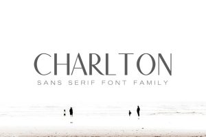
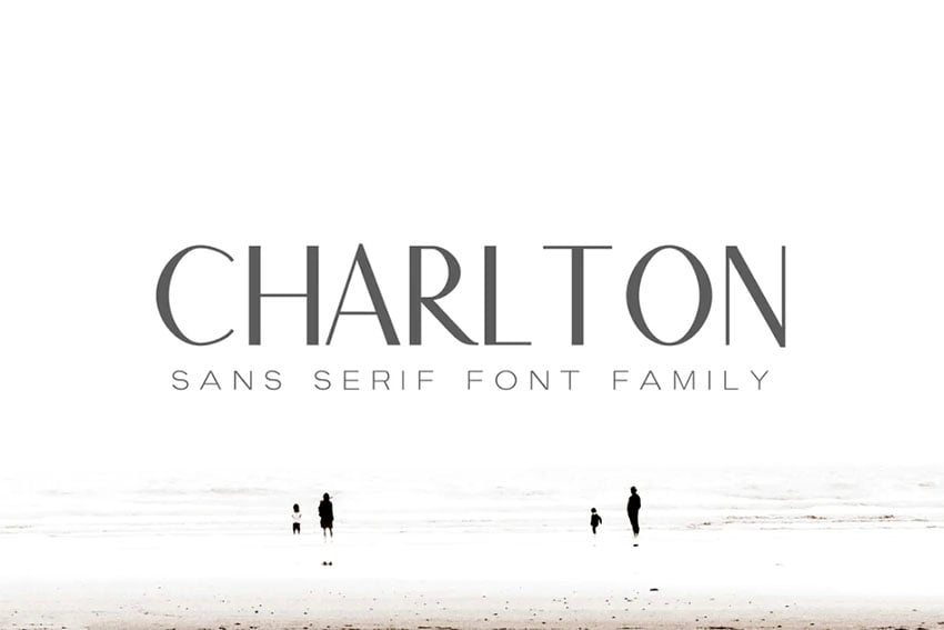
- Charlton – inspiration typeface
-
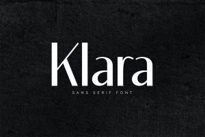
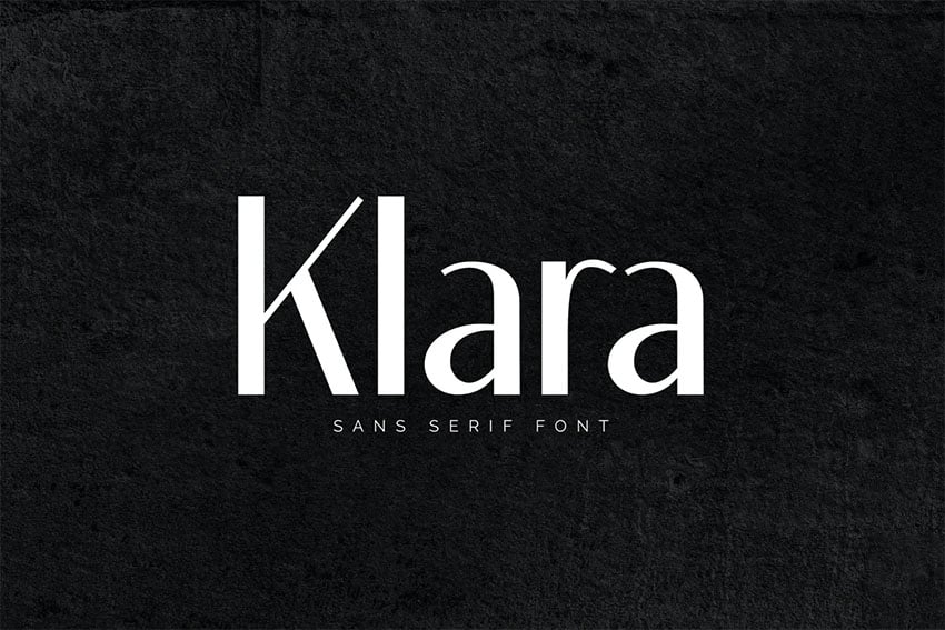
- Klara – inspiration typeface
-
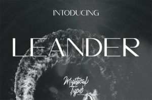
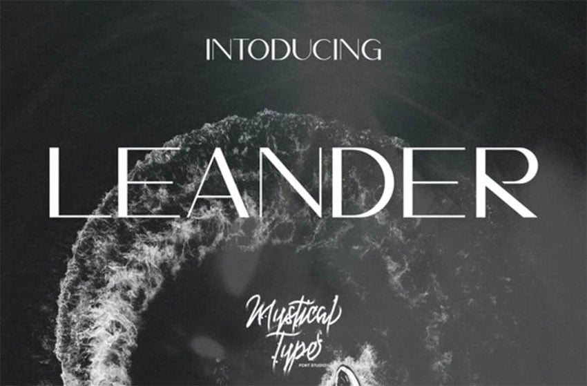
- Leander – inspiration typeface
-
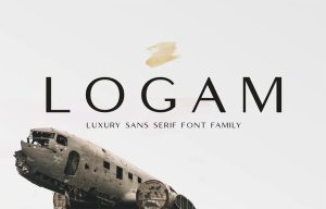
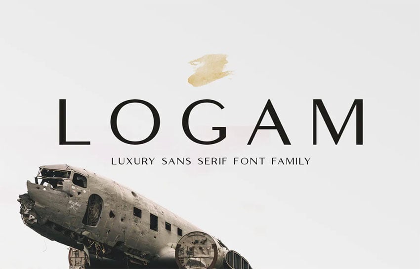
- Logam – inspiration typeface
-
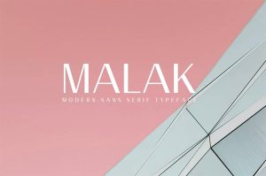
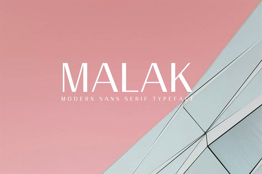
- Malak – inspiration typeface
-
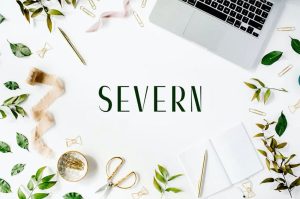
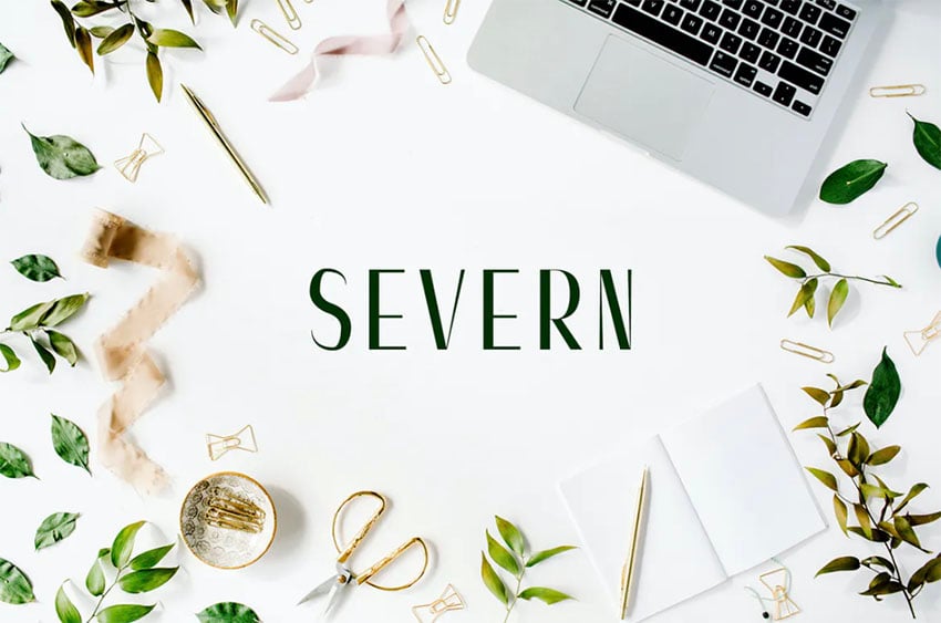
- Severn – inspiration typeface
-
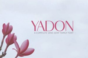
- Yadon – inspiration typeface